Using colour to drive brand engagement
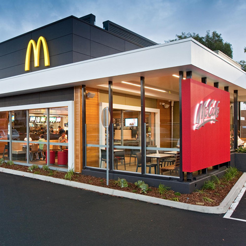
Take McDonald’s, with the golden arches that are often dubbed the most recognised brand in the world. The fact that those arches are golden is no coincidence. Gold is a colour associated with luxury or indulgence, while orange is a colour associated with food, and McDonald’s golden arches fit right into the center of that colour Venn diagram. The slim, curving arches also call to mind one of McDonald’s most iconic products: its French fries.
The primary colour red that makes up the remainder of McDonald’s branding is also carefully chosen. Red is an attention-grabbing colour, often associated with fast food. Together, the red background and the golden arches create a perfect colour combination that encourages people to make McDonald’s part of their regular dining experience.
Some colour environments, on the other hand, push customers away. In 2011, for example, Coca-Cola released its signature product in a white can, instead of the branded Coke red, to raise awareness of endangered polar bears. This new colour environment confused customers, who were used to seeing Coke in red cans and associated the pale cans with Diet Coke, which is branded in silver containers. Many customers assumed that the white Coca-Cola cans were yet another diet product and not the familiar Coke beverage they already knew and loved. The polar bear awareness campaign failed because the new cans were confusing and pushed customers away.

Colour theory – Understanding the colour wheel.
How do you choose the right colours with which to create your brand? A basic understanding of colour theory is good place to start:
- Purple, gold, and black are often associated with luxury
- Red and orange are associated with food
- Green is associated with healthy food, with the environment, with freshness, and with money
- Blue is a calming colour and often represents intelligence or thoughtfulness
- Yellow is lively and friendly
If you are launching a luxury product brand, for example, using a lot of reds and oranges will not create the desired environment. However, the same reds and oranges, with a little money-saving green thrown in, often work perfectly for discount or value brands. Additionally it can pay to challenge these conventions by combining unexpected colour combinations and in turn increase your brand’s visibility and achieve exceptional results for your business.
As a starting point consider how you need to position your brand within your target market, have an understanding how your brand compares to its competitors, and learn how you can use colours to both fit in and stand out in the category. A conversation with a branding agency is a good place to start. Even if you are not the most recognisable brand in the world, you can still use colour to create an environment that draws customers in and turns them into lifelong fans.
Related Articles
-

3 Reasons Why You Need a New Website
A professional looking, lead generating website is the first step for any Digital Strategy. There are many good reasons for needing a new website, but below are the TOP 3 reasons ...
More -
How Important Is Your Brand to Your Future Marketing?
Brand dwells in the minds of consumers for a long time, and therefore branding is essential to your future marketing. Opportunities grow with the right branding, whereas reputation and value ...
More -
Building Your Digital Brand Experience Online & Beyond
By going digital, you are expanding your marketing campaign online. You start designing a website as a digital representation of your brand, but how do you make it impactful? This ...
More -

Why Website Design Is One Of The Most Important Aspects Of Corporate Brand Rollout?
A brand rollout is a brand new start which has a roll on effect on all your marketing and promotional collateral – including online touch points like your website design.What ...
More